The flagship feature · companion to The Colors of Apple
The Logo & The Marks
The Colors page is broad and colourful; this one is its quieter companion. It’s a short, close history of Apple’s identity — the logo itself, mark by mark, plus the smaller pieces of iconography that shaped how the brand actually felt: the smile at startup, the pinwheel you learned to dread, the fonts you read a million words in without ever noticing.
Apple’s logo and marks are registered trademarks. This is an independent, editorial design-history page: every logo, icon and typeface below is an approximate, hand-built recreation rendered as inline SVG (or, for San Francisco, live text in the system font) — not an official brand asset. Colours and details are best-effort, and labelled where they’re uncertain.
The logo itself
Six co-founders’ worth of second-guessing, one bitten apple, and forty-odd years of Apple deciding — and re-deciding — exactly how grown-up it wanted to look.
01 · 1976–1977
The Newton crest
Apple’s very first logo has almost nothing to do with the one you know. It’s an intricate pen-and-ink drawing of Isaac Newton reading beneath a tree, a single apple poised to drop on his head, the whole thing wrapped in a ribbon border quoting Wordsworth: “a mind for ever voyaging through strange seas of Thought, alone.”
It was drawn by Ron Wayne — Apple’s forgotten third co-founder, who famously sold his 10% stake back for $800 within two weeks. As a mark it’s hopeless: far too fussy to shrink onto a circuit board or a nameplate, practically illegible at any real size. But that’s exactly why it’s the perfect opener. It tells you Apple began as a scrappy garage venture reaching for gravitas, before anyone had worked out what the company was going to look like.
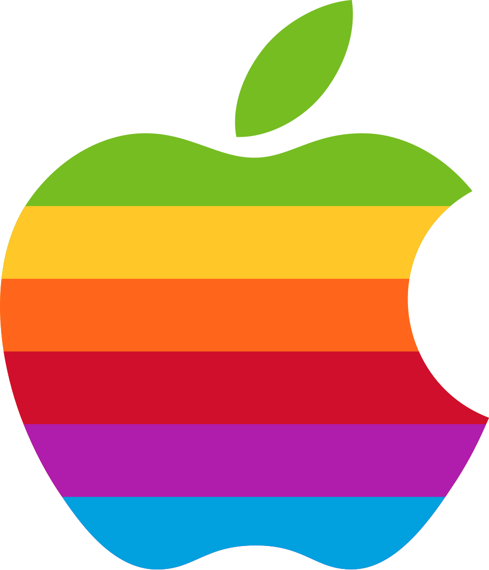
02 · 1977–1998
The rainbow apple
This is the one people mean when they say “the Apple logo.” Rob Janoff designed the bitten silhouette in 1977 for the Apple II — the first home computer that could put colour on a screen, which is what the six stripes are really about.
The bite is usually explained as a matter of scale: at small sizes a plain apple can read as a cherry or a tomato, and the notch fixes the silhouette so it can only be an apple. The tidy “bite = byte” pun you’ll see repeated everywhere is a myth — Janoff has said it was never the intent, and it’s worth debunking rather than passing along. One genuine bit of trivia: the stripes are ordered unconventionally, green on top so it sits with the leaf, not the ROYGBIV run of a real rainbow.
03 · 1998
The monochrome turn
In 1998, with Steve Jobs freshly back and “Think Different” on the walls, the rainbow was retired. The stripes gave way to a single solid fill — most often stark black or clean white, depending on what it sat against.
It’s a small change on paper and an enormous one in signal. Overnight the mark stops saying “fun, friendly, colourful computer company” and starts saying “serious design company.” It’s no accident this lands the same year as the Bondi Blue iMac: the colour drains out of the logo at the very moment it floods back into the hardware. The two shifts are the same decision seen from two sides — a company deciding, all at once, exactly how grown-up it wanted to look.
04 · 2001–2007
The Aqua / chrome era
When Mac OS X arrived with the Aqua interface, everything on screen turned to glass and water: pinstripes, pulsing buttons you “wanted to lick,” brushed metal, drop shadows on everything. The logo came along for the ride, rendered as a reflective chrome-and-glass pebble with a bright gloss across the top and a darker curve beneath.
This one resists flat vector reproduction on purpose — the gloss *is* the point — so the mark above is built from layered gradients rather than a traced outline. It’s the most of-its-moment the Apple logo has ever looked, perfectly matched to the sunflower iMac G4 and the Titanium PowerBook. It also dated the fastest, which is exactly why the next move was to throw all of it away.
05 · 2013–present
Flat design
With iOS 7 in 2013, Jony Ive took a fire hose to the gloss. Bevels, reflections, gradients and shadows were stripped out across the entire system, and the logo settled into what it is today: one flat, confident, single-colour silhouette that reads the same at 16 pixels on a phone and forty feet up the side of a store.
After the ornate Newton crest, the playful rainbow and the licked-glass chrome, this is the mark at its most self-assured — so sure of the shape that it no longer needs to decorate it. The bitten apple has become pure logotype: instantly legible, endlessly reproducible, and quietly the most valuable silhouette in the world.
The supporting marks
Not the logo — but just as much a part of how Apple looked and felt. The icons and typefaces you lived inside every day, most of them born on a tiny black-and-white screen.
01 · 1984–2002
Happy Mac
For nearly two decades, a healthy Macintosh said good morning by grinning at you: a tiny smiling picture of itself, drawn by Susan Kare, that appeared for a beat every time the machine passed its startup checks.
It’s easy to underrate now, but this was radical. Contemporary PCs booted to a cold, blinking, all-business prompt; the Mac booted to a face. Happy Mac was one of the first pieces of computer iconography designed to be *friendly* — to tell a nervous 1984 buyer, before a single word loaded, that this thing was on their side. It waved goodbye in 2001–2002 when Mac OS X replaced the boot sequence, and a small grey apple took its place.
02 · 2001–present
The spinning beach ball
Its real name is the spinning wait cursor. Nobody calls it that. To everyone who has ever watched it turn — and turn, and turn — it is the beach ball, or the pinwheel of death, and it means the app in front of you has stopped listening.
Mac OS X introduced it in 2001 to replace the classic Mac’s little wristwatch. As pure design it’s cheerful and well-made, a neat rainbow callback in a spinning disc. As lived experience it is possibly the single most resented thing Apple has ever shipped, which makes it one of the most-memed marks in the whole catalogue. A rare case of an icon whose craftsmanship and reputation point in completely opposite directions.
03 · 1984–2001, then the iPod
Chicago
Before typefaces had to look good on Retina glass, they had to survive a chunky, low-resolution CRT one pixel at a time. Chicago — Susan Kare’s original 1984 Macintosh system font — was drawn *as* pixels, not scaled down to them. It ran the whole interface: menus, dialog boxes, the Finder, every button you ever clicked on a classic Mac.
Its bold, tightly-fitted shapes were tuned to stay legible when each letter was only a handful of dots tall. That’s also why it aged into something warm and a little nostalgic. Apple gave it one last star turn two decades later as the default typeface of the original iPod’s click-wheel menus — a bitmap font from 1984 quietly running the most futuristic gadget of 2001.
04 · 2015–present
San Francisco
San Francisco is the typeface you are almost certainly reading Apple in right now. It arrived in 2015 for the first Apple Watch — a screen so small it needed a font engineered for it — and within a year it had replaced Helvetica Neue as the system typeface across iOS, macOS, watchOS and tvOS.
What makes it clever is that it isn’t one font but a family that quietly reshapes itself by size. SF Display, for headlines, runs tight with narrow spacing; SF Text, for body copy, opens the letterforms and the gaps up so small type stays readable. It’s the first Apple system font designed from the start for every screen at once — and, fittingly, the specimen above is set in the real thing on any Apple device.
A solo project by Kelvin — more writing and work at kelvinkay.com.
Last updated: 2026-07-04